

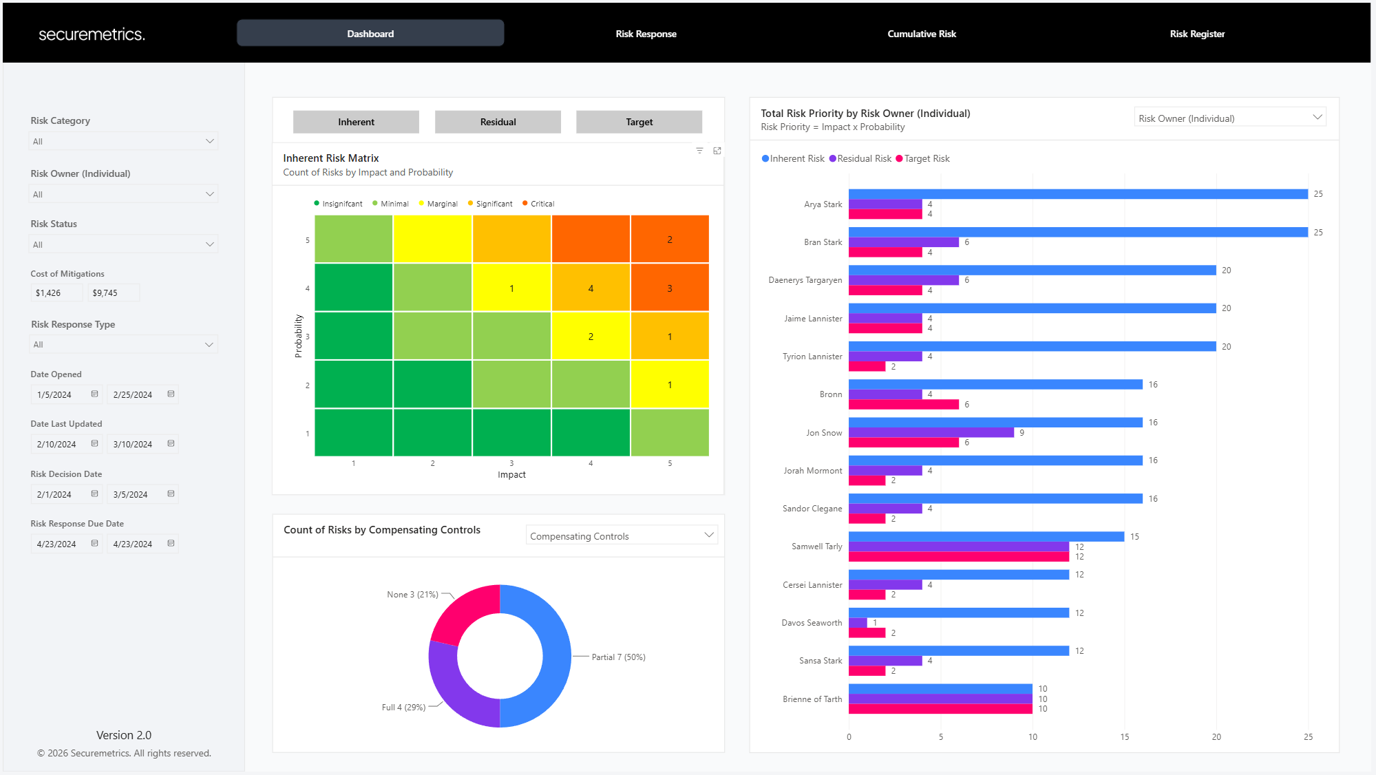
Today I’ve released a brand-new update to the risk register Power BI template. There are several functional changes to the front-end report design, an improved data model that makes it easier to customize, and an all-new custom developed risk matrix visual not available anywhere else.
Report Front-End
The Power BI report has been re-designed using a horizontal instead of a vertical layout. In addition, several charts have been retired in favor of dynamic charts with plot selections.
The report has been designed around four pages:
Dashboard
Risk Response
Cumulative Risk
Risk Register
Dashboard
The Dashboard page is a high-level overview of your risk register.
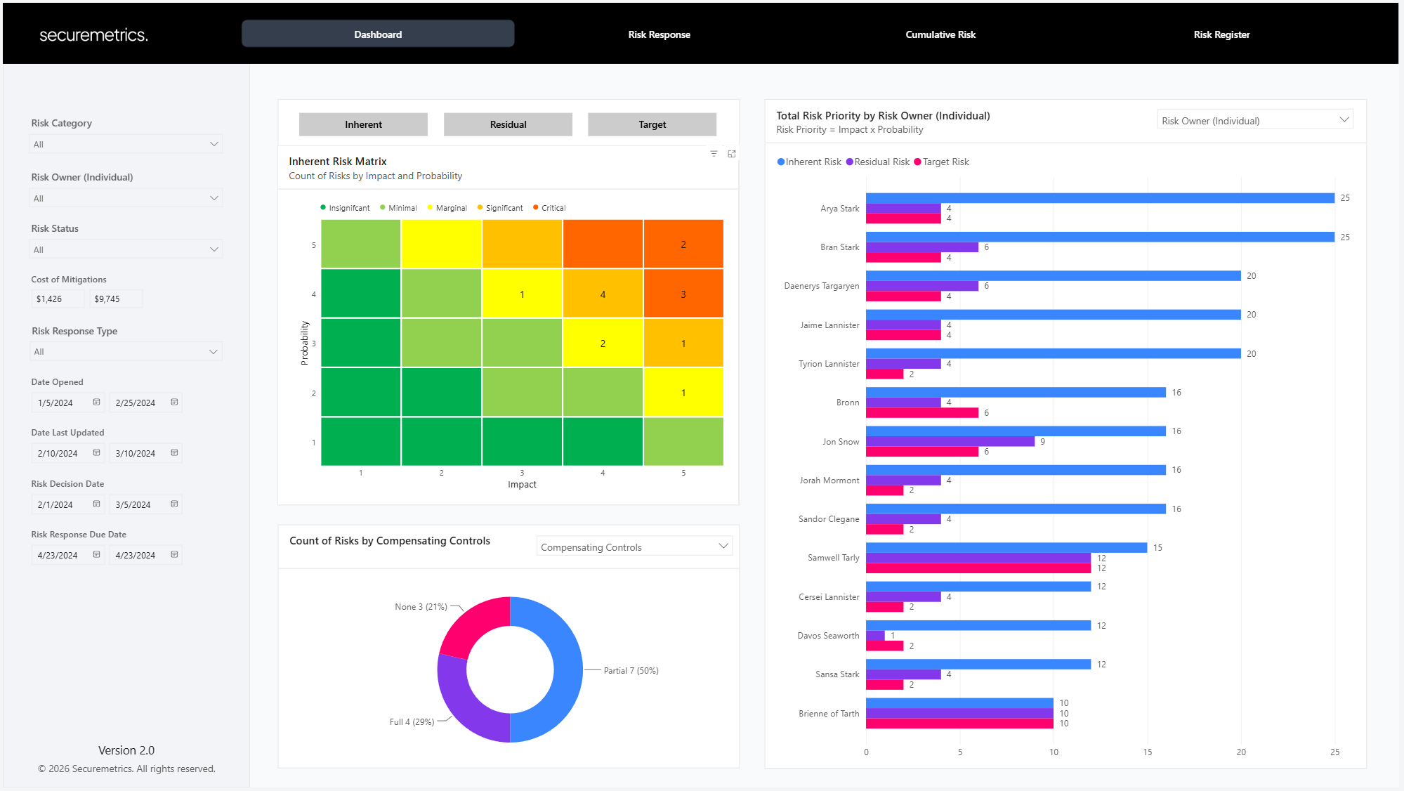
Risk Matrix
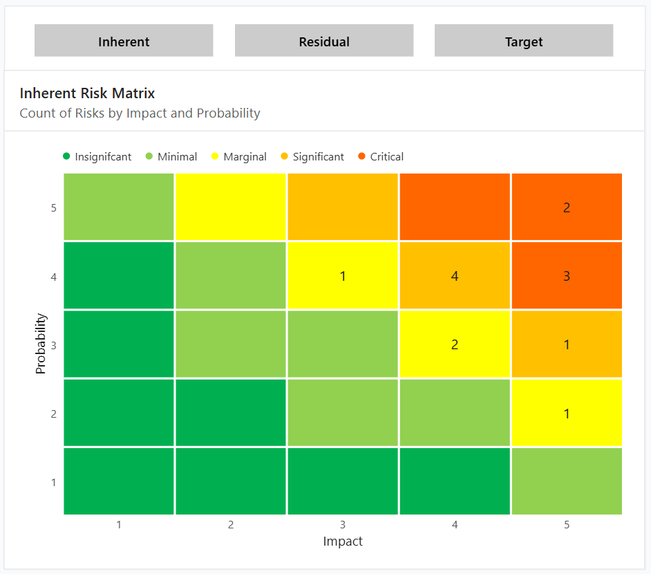
The Risk Matrix is a traditional qualitative risk matrix, plotting Impact on the x-axis and probability on the y-axis. This is a custom developed Power BI visual not available anywhere else. It was designed to be extremely configurable so you can use it with a variety of methodologies and naming schemas.
Some of the items you can configure include:
Matrix size (3x3, 5x5, etc)
Axis titles (Impact, Probability)
Legend titles (Minimal, Marginal, Significant, etc)
Risk Banding (Number of risk levels and thresholds)
Risk colors
Axis labels (1, 2, 3, etc.)
The three buttons above the Risk Matrix enable you to switch between plotting risks by their inherent, residual, or target risk.
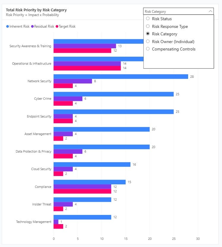
Total Risk Priority Bar Chart
The total risk priority bar chart plots the total inherent, residual, and target risk by a categorical field.
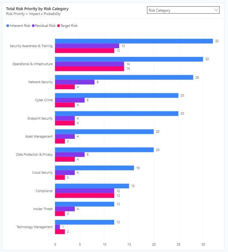
The category being plotted by (the y-axis) can be changed using the drop down in the top right of the visual. The bar chart can be plotted by the following fields:
Risk Status
Risk Response Type
Risk Category
Risk Owner (Individual)
Compensating Controls
Count of Risks Donut Chart
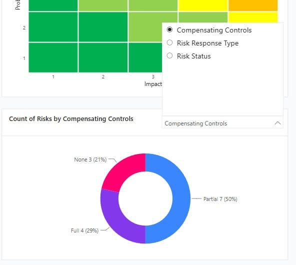
The count of risks donut chart plots the number of risks by a categorical field.
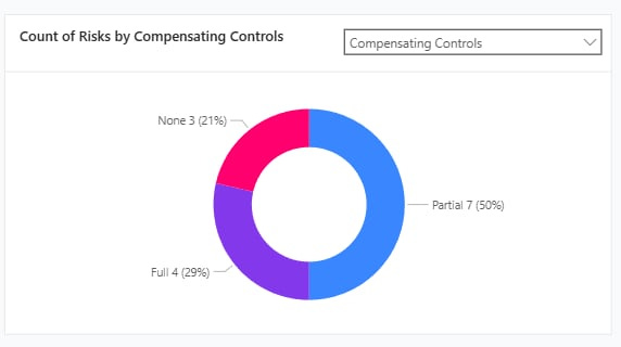
The category being plotted by can be changed using the drop down in the top right of the visual. The donut chart can be plotted by the following fields:
Compensating Controls
Risk Response Type
Risk Status
Risk Response
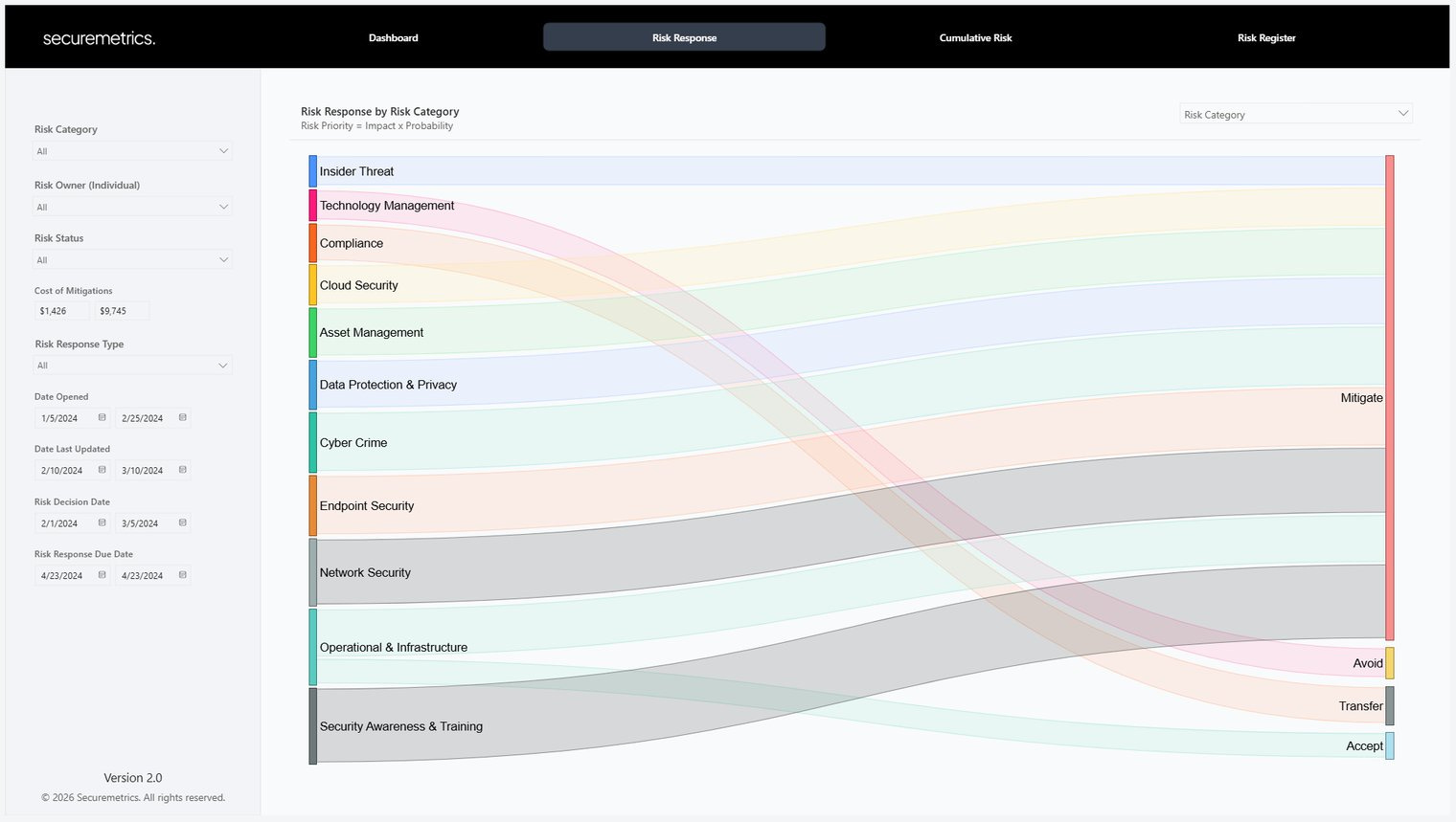
The Risk Response page shows the distribution of risk by the selected risk response types.
Risk Response Sankey Diagram
The Risk Response Sankey Diagram is the primary visual for this page. It plots a categorical field on the left and the risk response categories on the right, connecting each with streams. The size of the stream represents the total risk priority from each category.
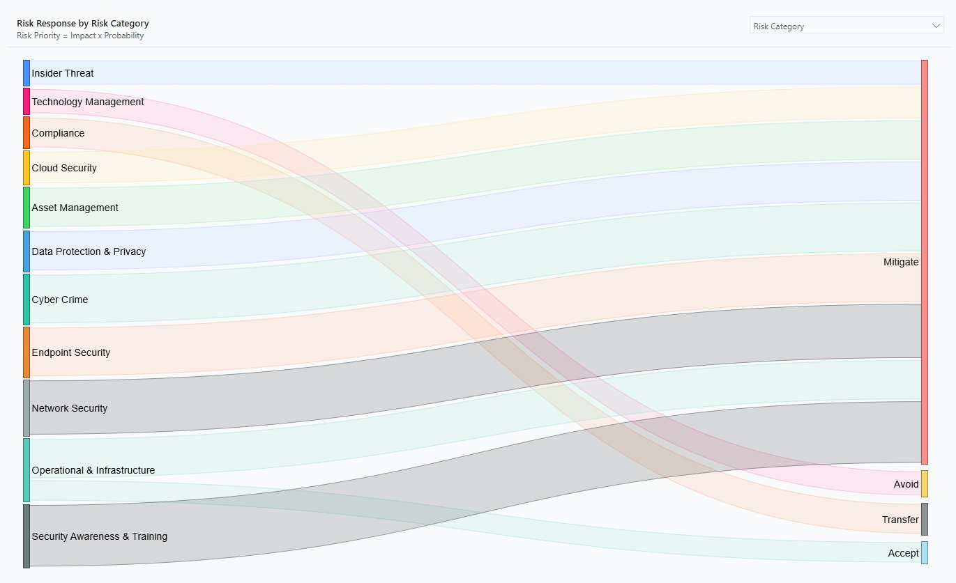
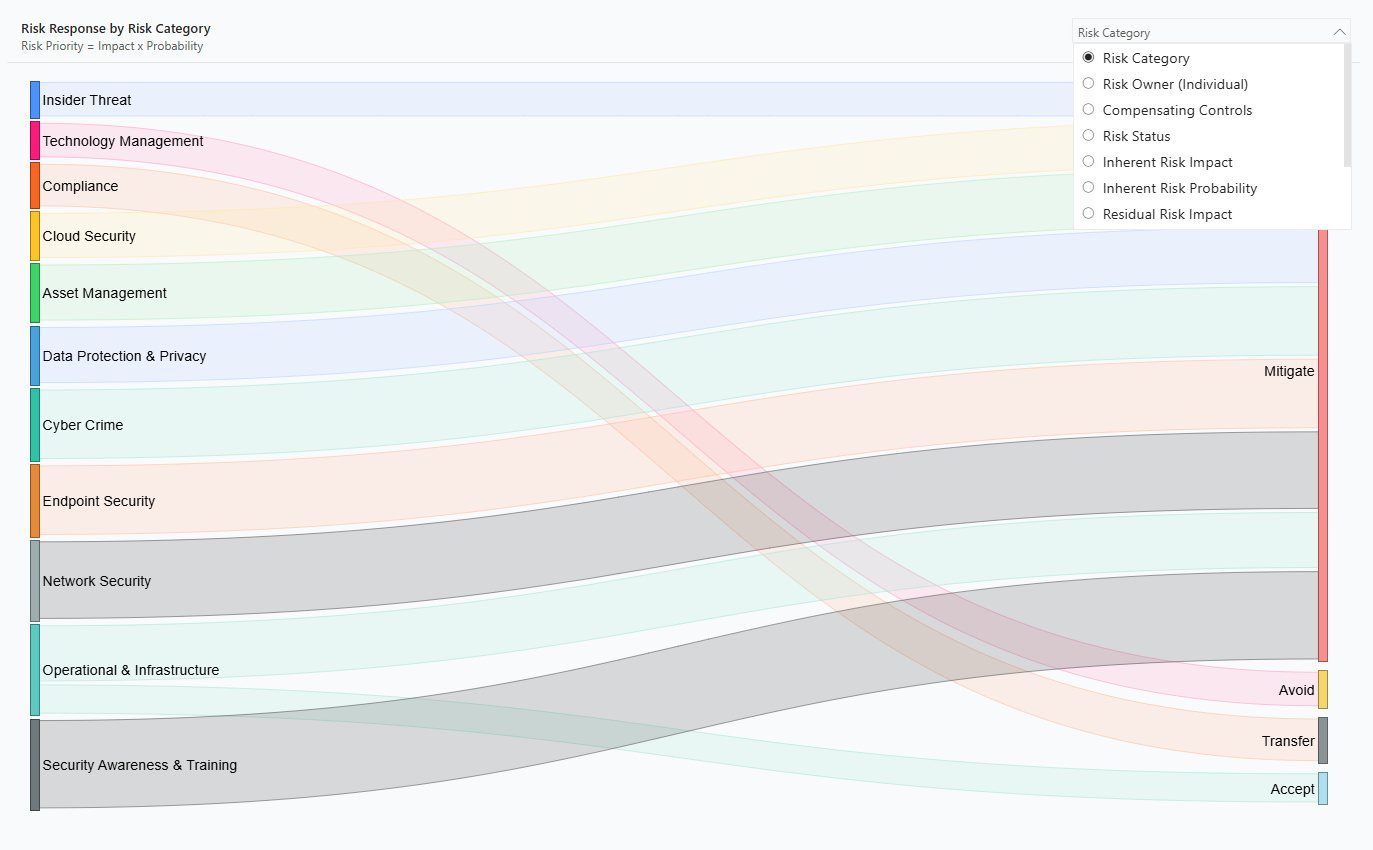
The categorical field plotted by (left-hand side) can be changed using the drop down in the top right of the visual. The following categories can be selected:
Risk Category
Risk Owner (Individual)
Compensating Controls
Risk Status
Inherent Risk Impact
Inherent Risk Probability
Residual Risk Impact
Residual Risk Probability
Target Risk Impact
Target Risk Probability
Cumulative Risk
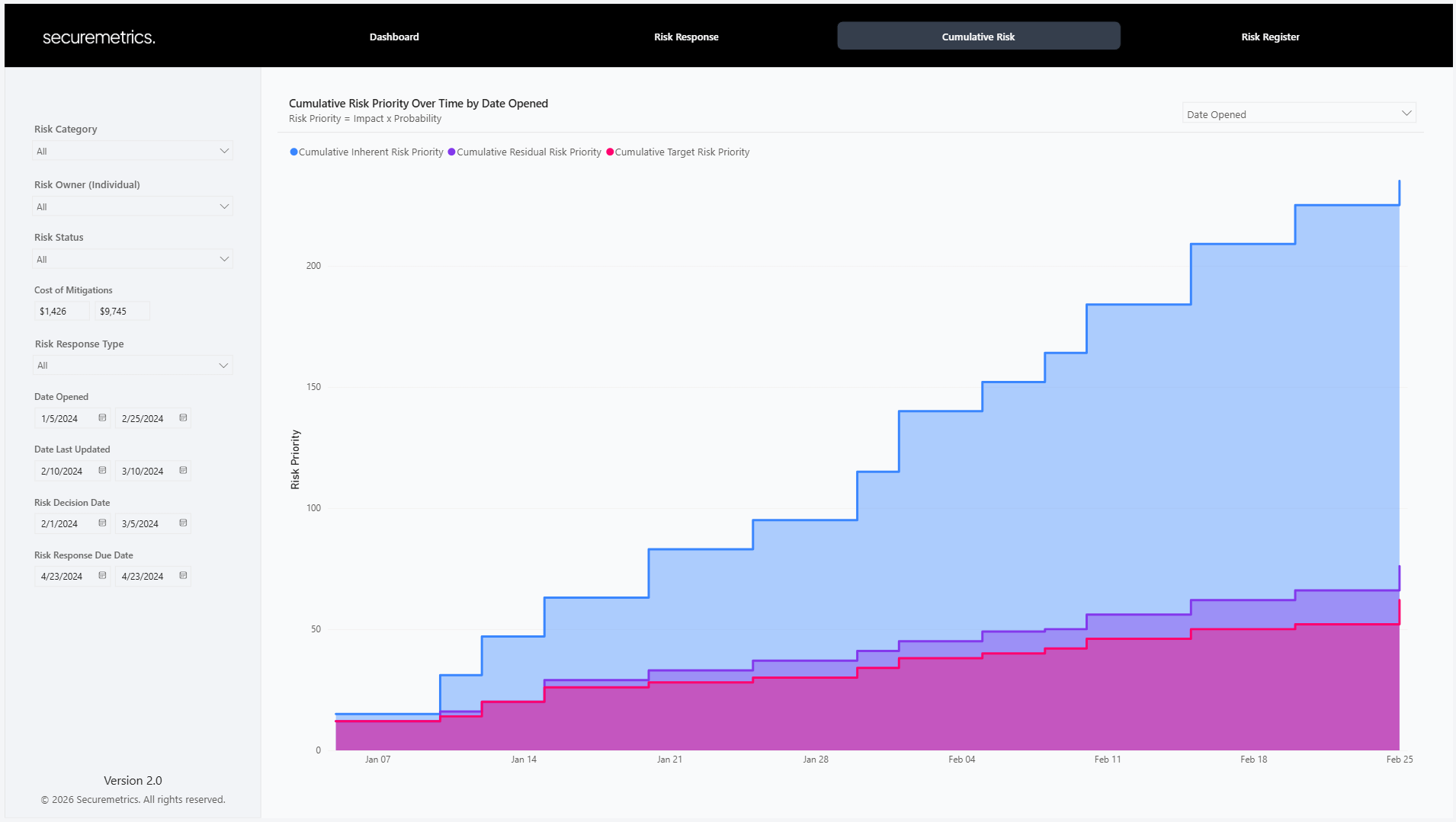
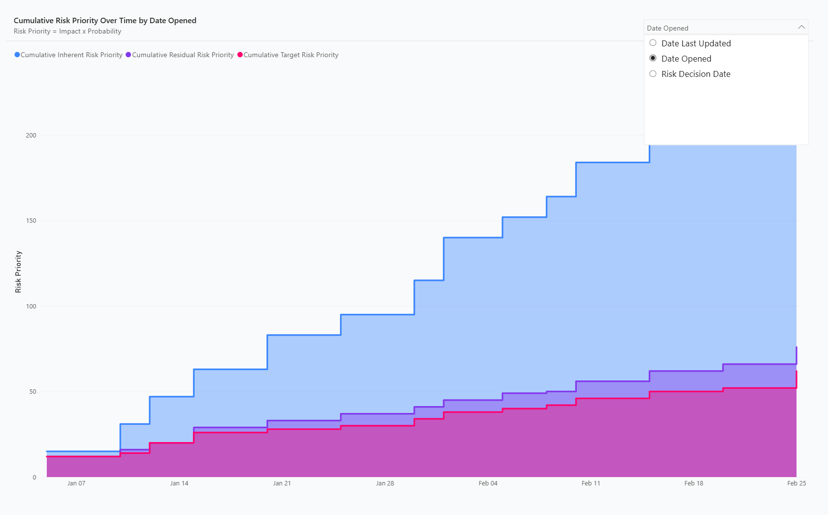
The Cumulative Risk page shows the cumulative (total) risk over time.
Cumulative Risk Step Chart
A step chart plots values that stay constant between changes and “step” up or down only when an event occurs, making it ideal for showing running totals or state changes over time.
The cumulative risk step chart plots the cumulative (running total) risk priority over time based on various dates.
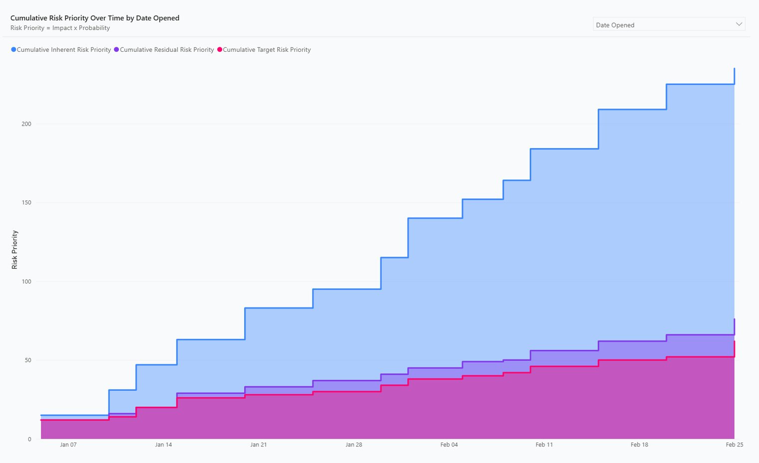
The date field plotted by (x-axis) can be changed using the drop down in the top right of the visual. The following dates can be selected:
Date Last Updated
Date Opened
Risk Decision Date
Risk Register
The risk register page shows the detailed risk register in tabular format.
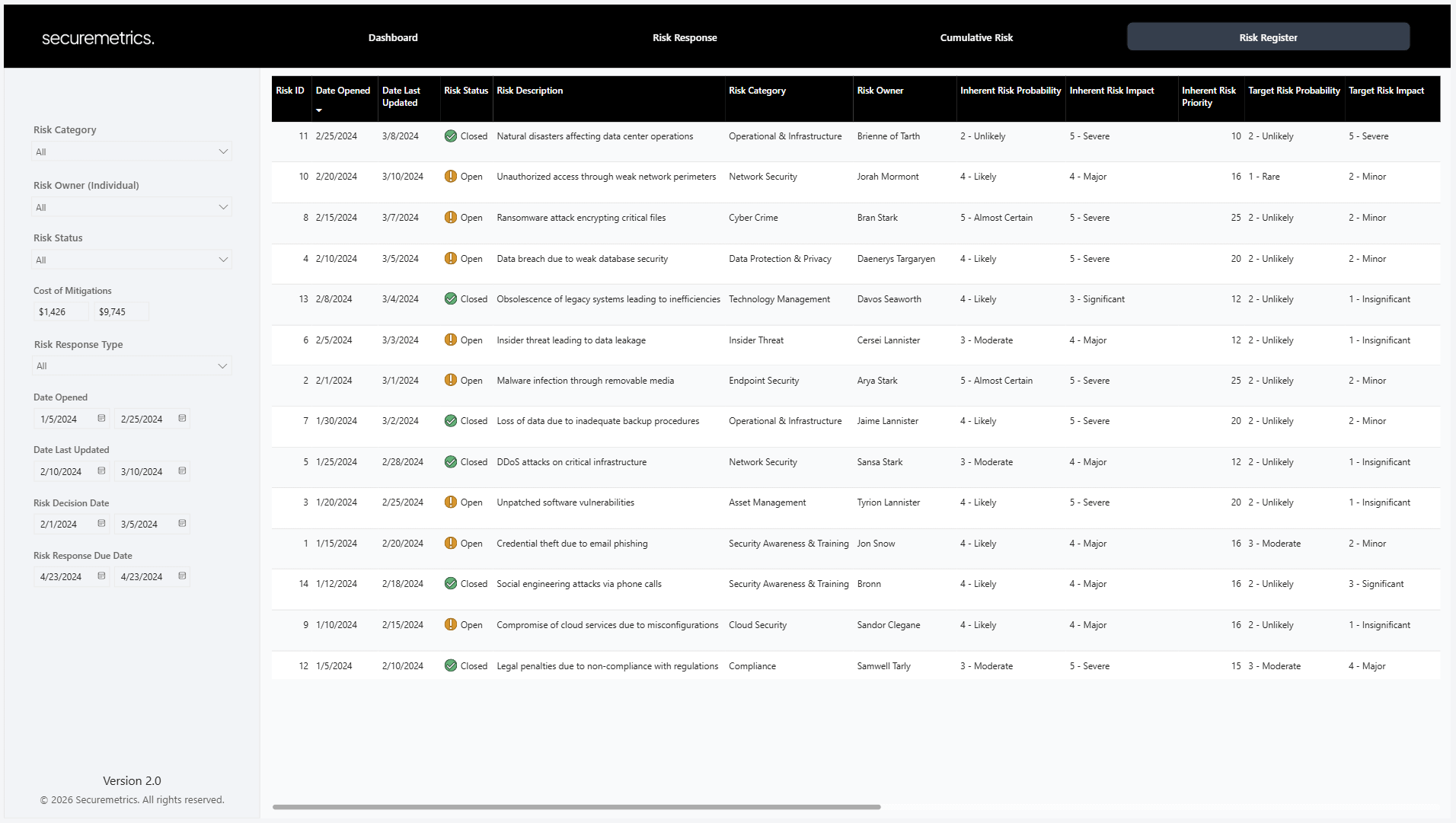
The Risk Register table has the following columns:
Risk ID
Date Opened
Date Last Updated
Risk Status
Risk Description
Risk Category
Risk Owner
Inherent Risk Probability
Inherent Risk Impact
Inherent Risk Priority
Target Risk Probability
Target Risk Impact
Target Risk Priority
Risk Response Type
Risk Response Controls
Risk Response Due Date
Cost of Mitigations
Compensating Controls
Residual Risk Probability
Residual Risk Impact
Residual Risk Priority
Notes
Data Model Updates
The data model has also been updated to make customization simple and straight forward:
New columns can be added to the Excel risk register and seamlessly flow through to the end data model
Naming schema for probability and impact values can now be customized
Risk matrix can be customized including risk thresholds, matrix size, colors, naming schema, etc.
How to Get It
The updated template is available for all existing risk register customers in the customer portal here. The template will work out of the box with the legacy Excel template, meaning you won’t need to transfer your data.
For new customers, you can grab the template here.
I hope you find it useful!
- Mitchell